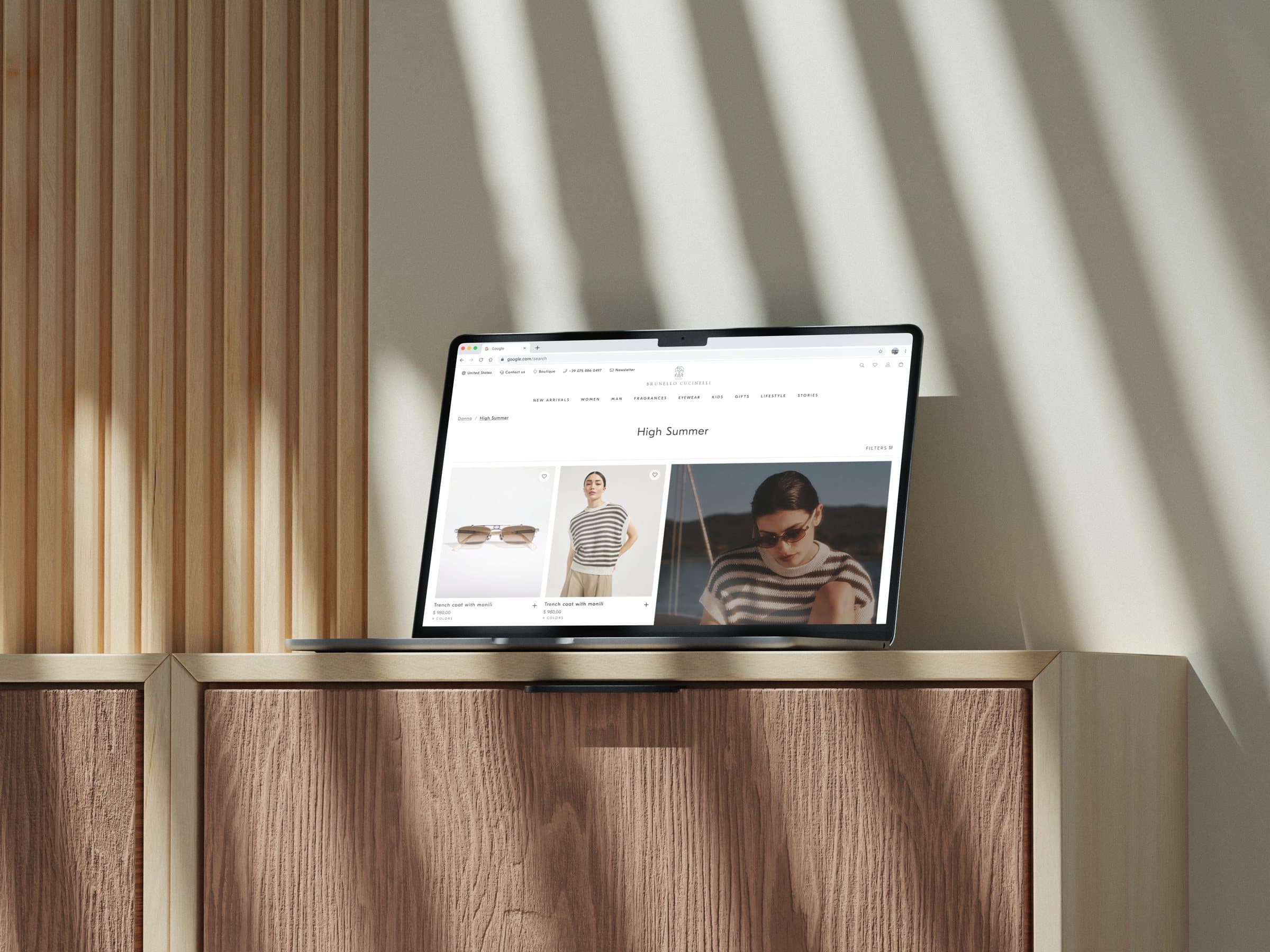
A product listing built to show more
A redesign of the Brunello Cucinelli listing page, driven by CRO data, that helps people see more products and brings editorial moments into the grid.

Problem
The CRO data was clear: on the product listing, people were not getting far. The layout used its space in a way that pushed products down the page, so users saw only a handful before losing interest. On top of that, the brand wanted the listing to be more than a plain grid, with editorial modules that speak to who Brunello Cucinelli is.
Activities
- Turned the CRO analysis into UX insight
- Designed the UI
- Built the components
- Kept everything aligned with the design system
Solution
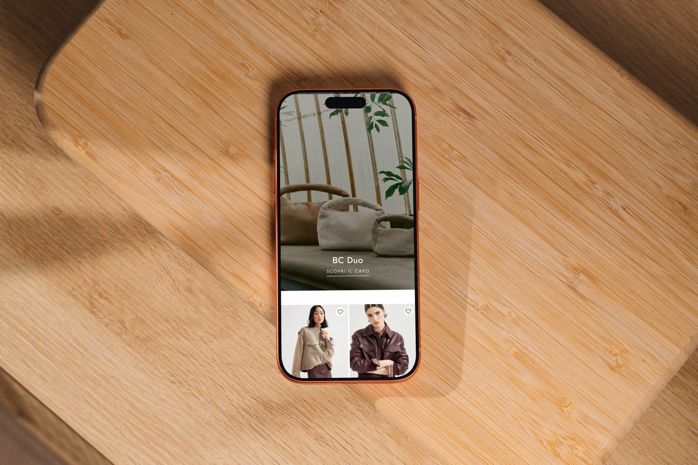
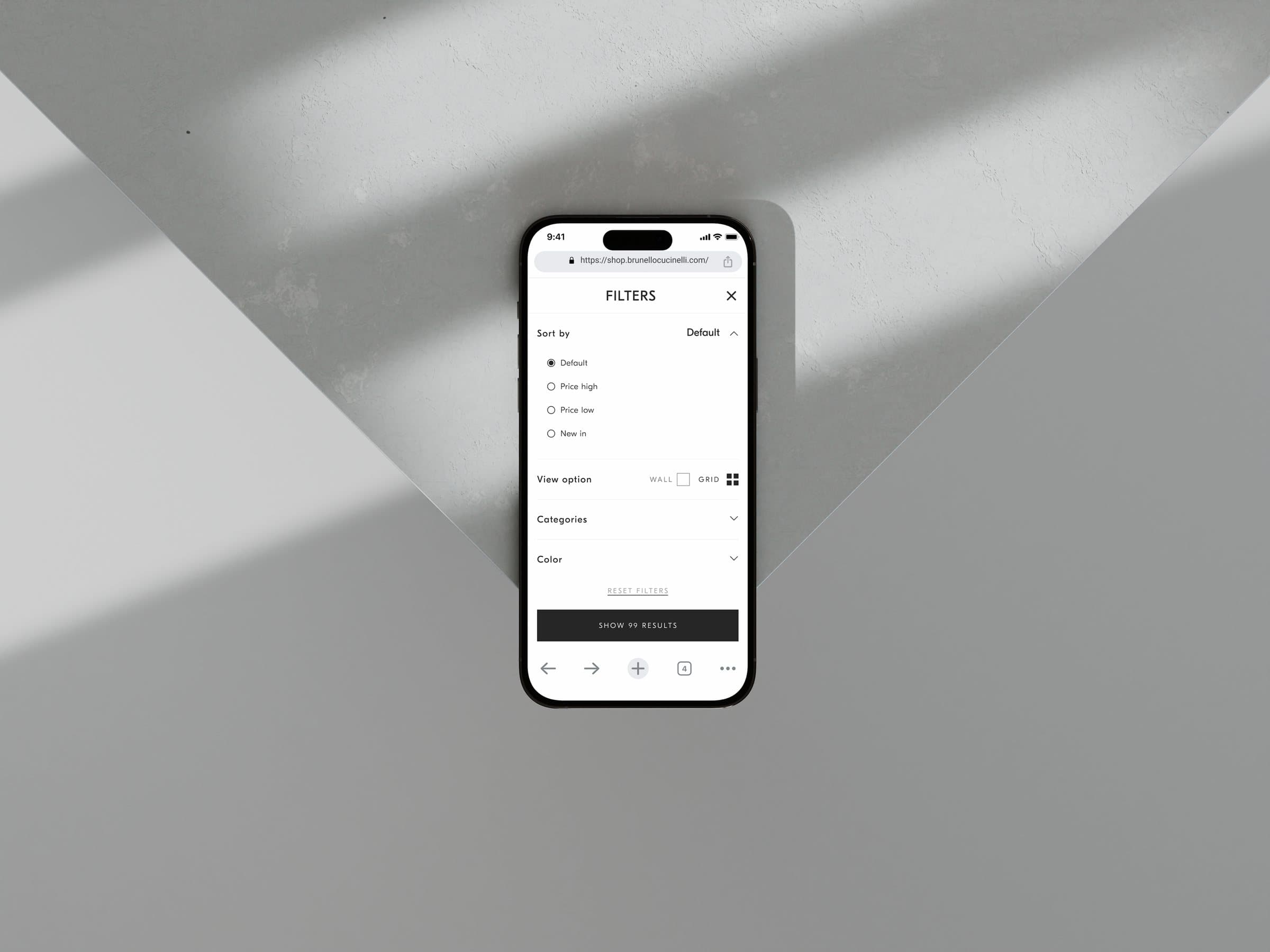
We reworked the listing so it makes better use of its space, which fixed the scroll problem and let people see more products with less effort. We also rebuilt the grid to hold editorial modules that raise the perception of the brand. The data afterwards told the story: people scrolled further, the editorial moments caught their curiosity, and they spent more time exploring the site.

OTHER WORKS